Components AI
Open siteArt & Creative Design
Introduction
Explore generative design systems
Components AI Product Information
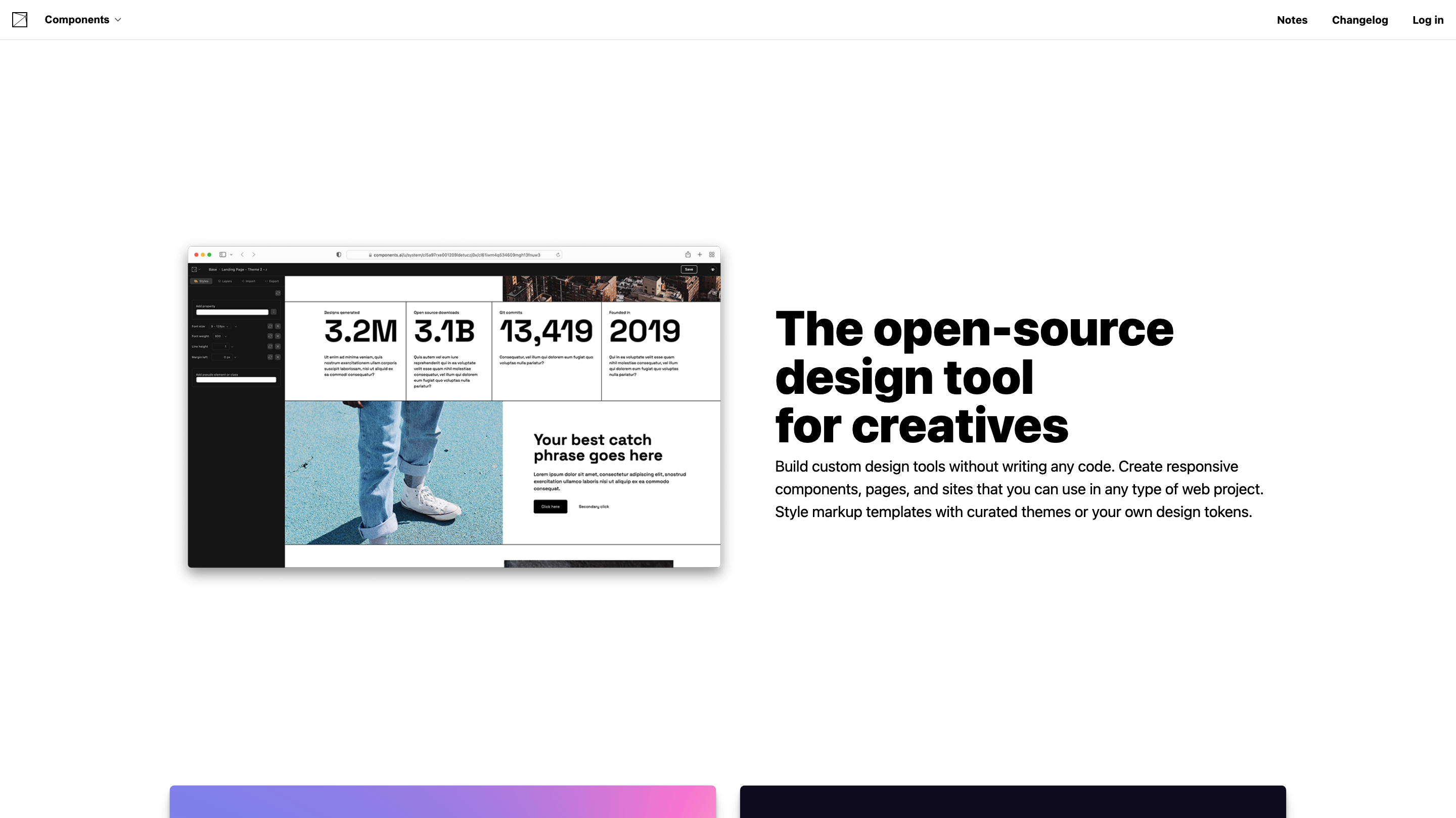
Components AI is an open-source design tool for creatives that lets you build custom design tools, generative components, pages, and sites without writing code. It emphasizes parametric, token-driven design workflows, theme-aware styling, accessibility, and fast collaboration. It supports exporting designs to multiple formats and publishing with one click, all while enabling you to manage design tokens, responsive systems, and brand guidelines in one place.
Overview
- Create responsive UI components, pages, and entire sites using a visual, constraint-based interface.
- Style markup templates with curated themes or your own design tokens for consistent branding.
- Define and reuse design tokens (colors, typography, spacing, shadows, etc.) across projects.
- Generate, augment, and curate a growing library of generative components for UI and graphics.
- Export designs in multiple formats (React, JS, JSON, JSX, SVG, PNG, HTML, CSS, CSS custom properties, Sass) and publish web pages and assets with one click.
- Built-in accessibility tooling and documentation to ensure compliant, usable designs.
How to Use Components AI
- Create or import a theme to establish your brand's color, typography, spacing, and motion rules.
- Design components or generative templates using parametric controls to define how designs evolve with input changes.
- Augment and iterate by adjusting parameters, locking inputs you want to preserve, and saving multiple iterations.
- Export or publish: choose a format (e.g., React, CSS, SVG) or publish hosted pages/assets for quick sharing.
- Audit for accessibility: leverage automated contrast and accessible combinations within themes to ensure inclusivity.
Core Concepts
- Constraint-based design: use scales, tokens, and rules to drive consistent outputs.
- Design tokens: single source of truth for colors, typography, motion, shadows, and spacing.
- Generative components: evolving UI elements that can be customized via parameters.
- Theme-driven workflow: import, edit, or create themes that automatically guide component styling.
- Multi-format export: broad compatibility with popular development and design pipelines.
- Accessibility docs: instant feedback on contrast and accessible combinations within a theme.
- Responsive theming: define breakpoints and ensure typography, layout, and spacing adapt across sizes.
- Variable font support: full access to custom axes for fine-grained typography control.
- Curated design assets: a gallery of presets and components to accelerate design work.
How It Works
- Define a theme and design tokens to encode your brand guidelines.
- Build or generate components that respect those tokens and constraints.
- Iterate by adjusting parameters, locking preferred inputs, and saving multiple iterations.
- Export to desired formats or publish directly as hosted pages with assets for styles (JS, JSON, CSS, HTML, etc.).
- Use automated accessibility tooling to ensure compliant color contrasts and accessible combinations.
Safety and Licensing
- As an open-source tool, contributions and usage should comply with project licenses and the terms of the source code repositories.
Key Features
- No-code/low-code design tool to build components, pages, and sites
- Generative components with parametric controls and design tokens
- Theme import and creation to enforce brand guidelines
- Constraint-based design workflows with scalable systems
- Multi-format export (React, JS, JSON, JSX, SVG, PNG, HTML, CSS, CSS custom properties, Sass)
- One-click publish for hosted pages and assets
- Automated accessibility docs and contrast scoring within themes
- Responsive theming for multiple breakpoints (typography, layout, spacing)
- Full variable font support for fine-grained typography control
- Curated presets and design assets for rapid iteration