kickstartDS
Open siteCoding & Development
Introduction
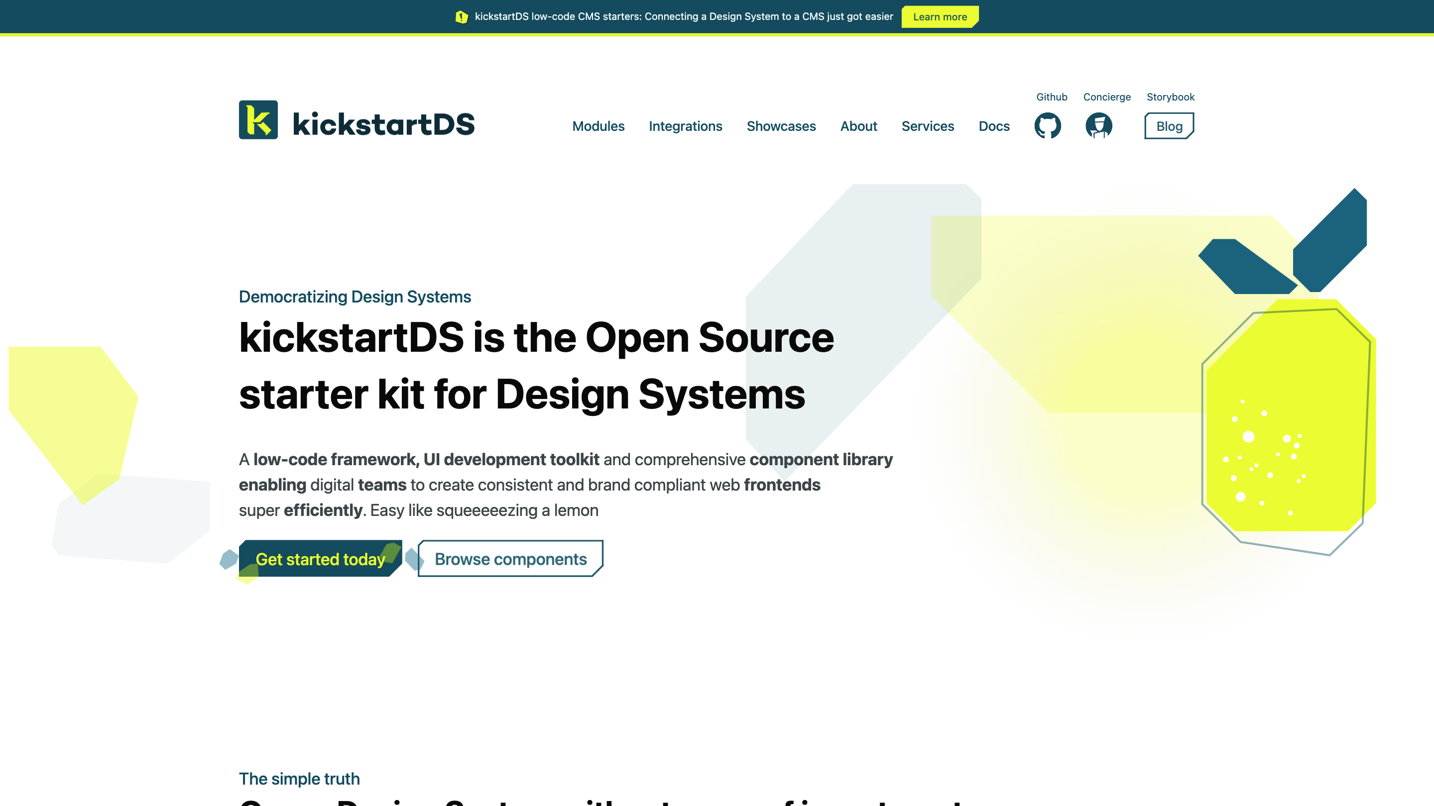
kickstartDS is a library for creating consistent and brand-compliant web frontends.
kickstartDS Product Information
kickstartDS – Open Source starter kit and next-gen UI toolkit for Design Systems is an open source low-code framework, UI development toolkit and comprehensive component library that helps digital teams build consistent, brand-compliant web frontends quickly. It combines design system guidance, reusable components, tokens, and integrations to accelerate frontend work while remaining framework-agnostic or easily consumable as ready-to-use React components. It emphasizes ownership, performance, accessibility, and a modular approach to design system development and deployment.
Key Value Proposition
- Create, maintain, and scale a Design System with minimal vendor lock-in
- Own your Design System and all code you build on top of kickstartDS
- Fast, lightweight components with design tokens and a robust token system
- Framework-flexible: semantic HTML, CSS Modules, and ES6 JavaScript; usable with any framework or standalone
- Ready-to-use CMS starters and deployment options for instant site generation
- Accessible by default, optimized for performance and responsive design
- Rich integration capabilities with modern web stacks and popular CMS/.headless CMS tools
How It Works
- Choose a Design System approach with ready-made components and design tokens
- Connect to your preferred web stack or CMS starters (Storybook-ready components, GraphQL API, etc.)
- Deploy quickly to production with open source tooling and minimal vendor lock-in
- Use Tale-like guidance from the Design System Concierge and Storybook to ensure consistency across teams
Design System Components and Tokens
- 26 Components as solid building blocks for reliable UI construction
- 250 Properties that encode practical decisions for everyday design problems
- 500 Tokens including colors, fonts, sizes, and iconography for customization
- Semantic HTML, CSS Modules, and ES6 JavaScript for framework versatility
- Ready-to-use React components directly in your codebase
- Design System tokens and token-driven theming for consistent theming across products
Design System Services and Integrations
- Design System services to assess whether you need a Design System and align frontend inventories with kickstartDS components
- Integrations with Storyblok, Netlify Create, Sanity Studio, Wordpress, GraphQL APIs, and more for CMS-driven or static sites
- SSR- and ESM-compatible architecture for modern deployment
- Access to Content Module and seven rich content-building components for diverse experiences
How to Use
- Start with CMS Starters to connect your content sources and deploy quickly
- Browse components and tokens to assemble your UI
- Use Storybook to ensure alignment across responsive scenarios
- Leverage the Design System Concierge for expert guidance and adoption strategies
Safety and Best Practices
- Open source with transparent ownership and no vendor lock-in
- Designed for accessibility (WCAG-inspired practices) and keyboard navigation
- Focus on performance with a light runtime and modular design
Core Features
- Open Source starter kit for Design Systems
- Low-code UI development toolkit with a comprehensive component library
- Framework-agnostic: semantic HTML, CSS Modules, and ES6 JavaScript; React-ready components
- Design tokens system for consistent theming
- 26 core UI components and 250 component properties
- 500+ design tokens covering colors, fonts, sizes, and icons
- Out-of-the-box CMS starters and deployment options
- Storybook integration for design-system-driven development
- Accessibility-first and high-performance by default
- Rich integrations with popular CMSs, hosting, and API tooling
- Design System Concierge for guidance and adoption support