Ai Colors
Open siteArt & Creative Design
Introduction
AI color palette generator for UI design
Ai Colors Product Information
AI Colors Generate Complete UI Color Kits
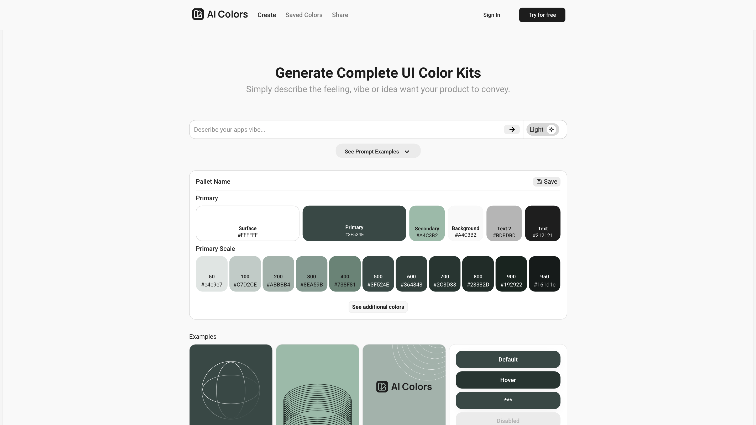
AI Colors is a design-assisted tool that creates comprehensive UI color palettes tailored to your product, vibe, or brand. It emphasizes instant, precise, and effortless palette generation to drive consistent visual language across surfaces, text, and UI components. The interface showcases semantically named color tokens, scalable shades, and guided prompts to help you craft cohesive color systems quickly.
How it feels and what it conveys
- Evokes clarity, balance, and modern professionalism
- Supports accessible, high-contrast combinations across light and dark modes
- Enables rapid exploration of branding tones from subtle to bold
How to Use AI Colors
- Describe the desired feeling or idea for your product (e.g., calm fintech, energetic healthcare, premium SaaS).
- Review generated palettes that map to semantic color roles (Primary, Surface, Background, Text, etc.).
- Choose or customize a palette and save it with a pallet name for reuse across projects.
- Apply the palette to UI tokens, components, and pages within your design system.
Palette Structure and Naming
- Palette defines standard UI tokens:
- Primary, Surface, Background, Text (and Text 2)
- Text colors include accessible contrast relationships
- 9-step shade scale (50, 100, 200, 300, 400, 500, 600, 700, 800, 900, 950) for granular control
- Includes a labeled color family with hex values ready for design handoff
UI Tokens and Visual System Elements
- Primary
- Surface
- Background
- Text 2
- Text
- System Status colors (Success, Warning, Error)
- Neutral greys for borders, dividers, and disabled states
- Type scale compatibility (Aa Typeface options shown in the interface such as Roboto)
How It Works
- You provide a concept or vibe, and the AI proposes a full color kit aligned to semantic roles.
- The palette includes multi-tone scales to support light/dark surfaces and layered UI.
- Palettes can be saved, named, and reused across projects for consistency.
- The tool may present related UI variables (including surface, surface-00, text, and status colors) to streamline integration with design systems.
Safety, Accessibility, and Best Practices
- Aim for accessible contrast between text and background across all tokens.
- Use the semantic roles to maintain consistency when swapping themes or surfaces.
Core Features
- Instant AI-generated UI color palettes tailored to brand vibe
- Semantic color tokens: Primary, Surface, Background, Text, Text 2, Status colors, and neutrals
- Multi-step shade scale (50–950) for nuanced UI depth
- Save palettes with custom names for reuse across projects
- Palette previews and example contexts to visualize usage
- Easy integration-ready seeds for design systems and tokens
- Support for consistent typography and UI systems alongside color (e.g., Roboto typeface presets shown in interface)